|
These images are pretty basic to be quite honest. Each one of them has a twist on it using different techniques for photography. On the portrait image, I used the rule of thirds technique. For the other images I did not use any non-ordinary technique.
These images were inspired by the great people around me. I did not try to show any emotions in my photography. My goals were to learn new techniques for taking photographs. These will influence my pieces of photography in the future because I know know what to look for.
0 Comments
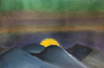 This piece of art is abstract yet it followed (and strayed off of) a beaten path. The colors blend well together despite being complementary in a few areas. The blue in the mountainous sky really brings them out as if they weren't just boring blobs of gray.
The art piece was created with pastels to blend the colors together. Though it was very messy. The big idea was to simply experiment yet again with the pastels to ensure that in future projects, I know what is acceptable to use in any scenario. My overall thought for this image is that it works very well together and overall it's a win, win. 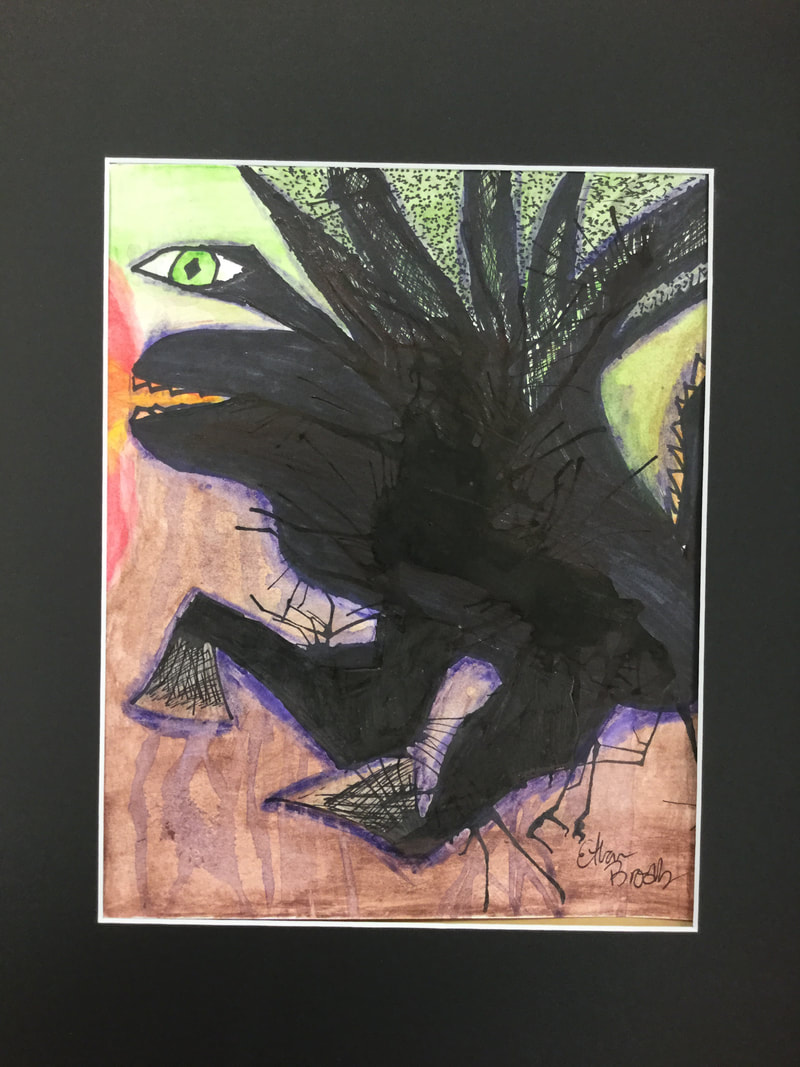 This artwork was basically freelanced because we unknowingly started off by blowing ink around the paper to create an abstract design in which we would draw a monster or some other type of object or being. It kind of looks like a one eyed monster frog and the thing that brings it out the most is it’s eye.
For this piece, we used watercolor pencils, ink, graphite, and paint brushes. This was not inspired by anyone, although, we were given examples of similar projects; there are also no emotions portrayed in this artwork. My goal for this piece of art was to learn how to create art without having a plan and I did reach my goal because we started with ink splats. I learned how to freelance art while creating this piece. It will help me in future works because now I have developed a skill in freelancing art. 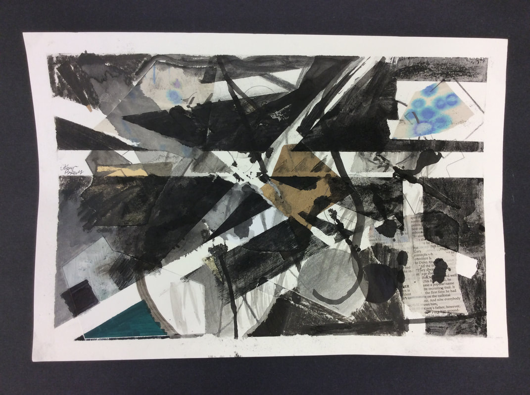 Clearly this work of art is very abstract. It has a variety of colors thanks to the drip paper scraps. It has a lot of black and white as well. I call this piece “the Strange News” because of the newspaper cut out that is visible. The largest visible element of art on my piece is line, while it also incorporates texture due to the wrinkled brown paper. My artwork is made from multiple types of media, we have different paper, different materials, and they all work together to blend the image. We used charcoal, ink, graphite, and a lot more art materials to create this image. We used a technique called layering so that we create beautiful blank lines on our paper with tape. There was no inspiration for this piece because I just freelanced it. My artwork does not express a personal or social issue, but, it did take some stress away as we just focused on creating the art. There are no emotions shown in this work. My goals as an artist are just to get rid of stress as we only have to focus on our piece of art. This artwork did help me reach that goal because I did in fact release stress.
I learned the layering technique while I made this work of art and I also learned how to use new materials like charcoal, ink, and various new paper types. This is what I imagined my artwork would come out to look like since it was abstract and we were given examples prior to starting. This art will influence my future works by giving me the experience of using new materials. |
AuthorEthan Brooks I find inspiration for most of my pieces from motivation to (slightly) change the world. My favorite pieces to create have the medium of recycled material. I often times prefer abstract art over any other form.
Archives
December 2017
Categories |
 RSS Feed
